柱状图
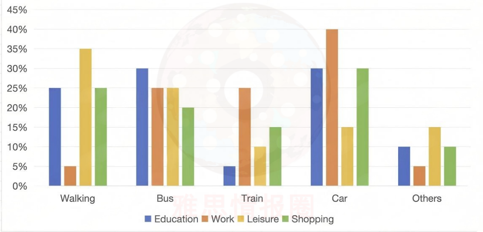
The chart below shows the percentage of people choosing different ways for different purposes in the UK in 2013.
Summarise the information by selecting and reporting the main features, and make comparisons where relevant.
题目来源:2025年11月15日大陆雅思小作文
1、题目大意
下图显示了2013年英国出于不同目的选择不同方式的人的百分比。
2、高分范文示例
开始段 - 改写题目+总结
The bar chart illustrates the proportions of people in the UK in 2013 who travelled by five different modes of transport (walking, bus, train, car, and other) for four purposes: education, work, leisure, and shopping. Overall, car travel was the most common mode for all purposes except leisure, where walking was predominant. Additionally, bus use was relatively high for education, whereas train and other forms were generally the least utilized.
第一段 - 教育和工作目的
In education-related travel, buses and cars were equally the most popular modes, at 30% each, followed by walking at 25%. Only 5% used trains for education, while the remaining 10% relied on other means. By contrast, for work, car travel dominated, with 40% of commuters using this mode. Buses and trains each accounted for 25%, and the remaining 10% was split evenly between walking and other means.
第二段 - 休闲和购物目的
For leisure, walking was the most favored mode at 35%, followed by car at 25%. The remaining options had much smaller shares, with bus and other means at 15% each and train the least used at 10%. For shopping, car was the most used mode at 30%, followed by walking (25%), bus (20%), train (15%), and other modes (10%).
必备语料
was the most commonly used mode 是最常用的交通方式
was particularly prevalent for… 在……方面特别普遍
accounted for 30% of all trips 占所有出行的30%
by contrast / in contrast 相比之下
dominated work-related travel 在工作相关出行中占主导地位
was the least preferred option 是最不受欢迎的选择
showed a clear hierarchy of usage 呈现出明显的使用梯度
was split evenly between… 在……之间平均分配
a markedly higher share than… 比……显著更高的比例


